


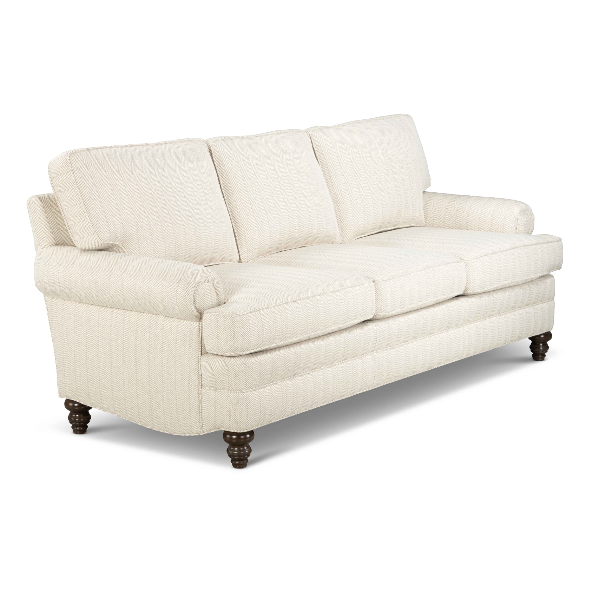
When it comes to putting the finishing touches on a room, a few details that first come to an interior designers mind may be area rugs, curtains or coffee tables. What can sometimes be overlooked however, is artwork. This doesn’t have to come in the form of hanging a drab, one coloured painting on the wall. A variety of intricate possibilities exist to customize your clients living space with a fun twist. This blog post will examine a few handy tips & tricks that will help you in matching artwork to furniture.
Tip #1: Narrow the Field
Art is very subjective, and choosing the perfect piece for a room takes some time. Firstly, determine the clients preferences: Do they value modern or contemporary? Colour, or black & white? Abstract or non-objective? This information will help narrow down to specific artistic concepts to work with.
Tip #2: Find Inspiration
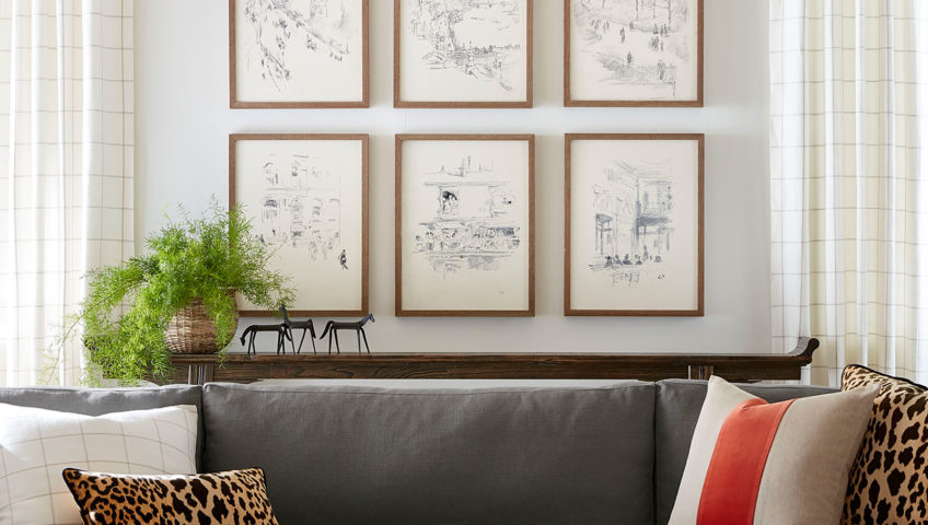
If you are visiting an art gallery, what is the one factor that tends to draw you towards that painting? Colour. This concept should be applied when choosing the proper artwork for a room. A good rule of thumb is to choose artwork with a colour that appears somewhere throughout the furniture. Find hints and subtle shades that the client enjoys most, whether this be in the colour of the frame or a fine detail in the art itself. In some cases, clients will want to design a new room around a piece of artwork. Perhaps it was a family heirloom or a painting made by a friend, which is a prized possession to them. Custom made furniture is the most effective solution in this case- allowing you to extract favored colours from the “masterpiece” and arrange them throughout the furniture.
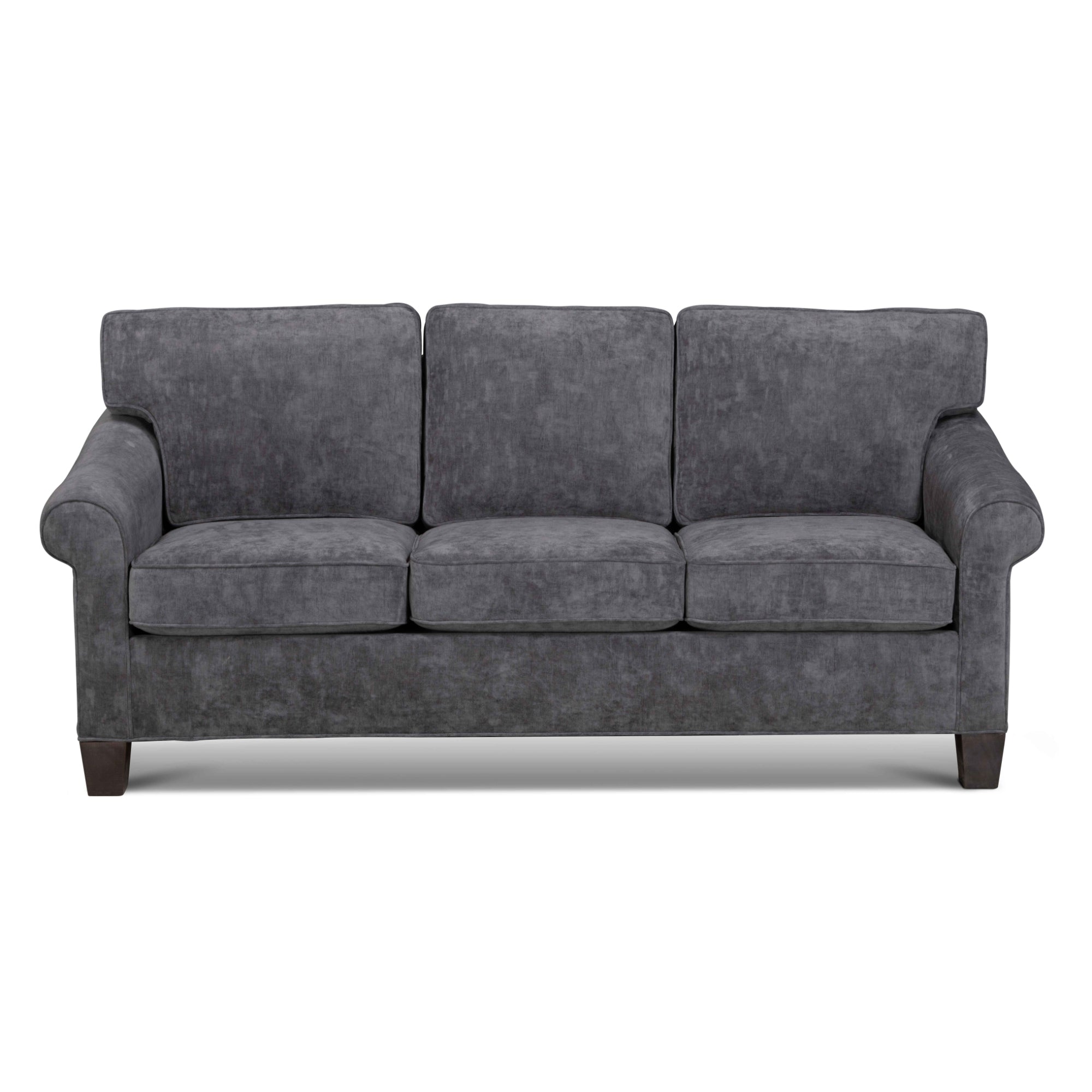
Tip #3: Opposites Attract
Next on the matching checklist are lines and patterns. When it comes to the fine detailing of art, this doesn’t have to be specifically matched to the furniture. Let’s assume that you are working with stained glass wall art. In this piece, there are a variety of curved lines drawing the eye in a multitude of directions. As the artwork is compound, it is best to choose a solid base colour as there won’t be any pattern clashes or mismatches. On the other hand if the artwork is of a simpler landscape, it would be suitable for the furniture to have a bolder pattern in the fabric.
Tip #4: Balance & Perspective
Once artwork is matched to the furniture through colour and pattern, focus on the positioning of the art is next. In the case of your living room or family room, artwork should be about two thirds the width of the sofa or sectional you are working with, as you don’t want the piece to overpower the room. If you are working with smaller artwork, try hanging it in the middle of the furniture to keep the room balanced. Another option would be to choose a few small paintings or pictures and hang them in a unique configuration, adding some “feng shui” to the room. The collage doesn’t have to be completely symmetrical. Having artwork hung at different levels will create a more distinctive visual effect.
Remember to have fun and play around with the versatility of artwork, while sticking to the overarching theme of the room. These newly decorated spaces generate a great focal point and centerpiece of discussion among guests. You never know, this just might encourage your client to want to throw that next holiday party or Saturday evening gathering to show off their new space!


